Feeling unwell is already stressful. Figuring out which doctor to book should not make it harder.
CareRoute
Product UX / mobile booking flow
CareRoute helps users understand where to go next. It asks a few focused questions, recommends a suitable care type, and makes it easy to compare doctors and book an appointment.
Designed for non-emergency health concerns. The app does not diagnose users. It helps them choose a clearer next step.
CareRoute asks about symptoms, recommends a suitable care type, and shows matching doctors nearby before booking.
Design process
Jump to a stage of the case study.
Main Flow Preview
The full product journey, from onboarding to booking management.
Drag or scroll through the complete CareRoute prototype before reading the process behind it.
Main flow preview
Every key screen is shown in sequence.
Drag / scroll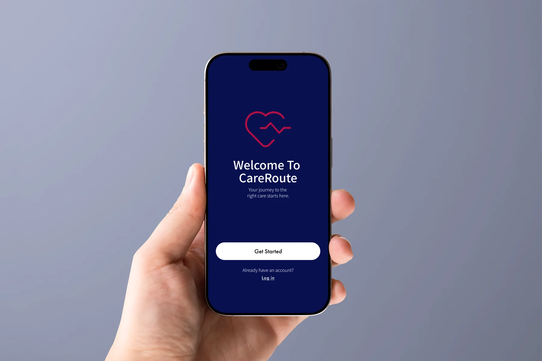
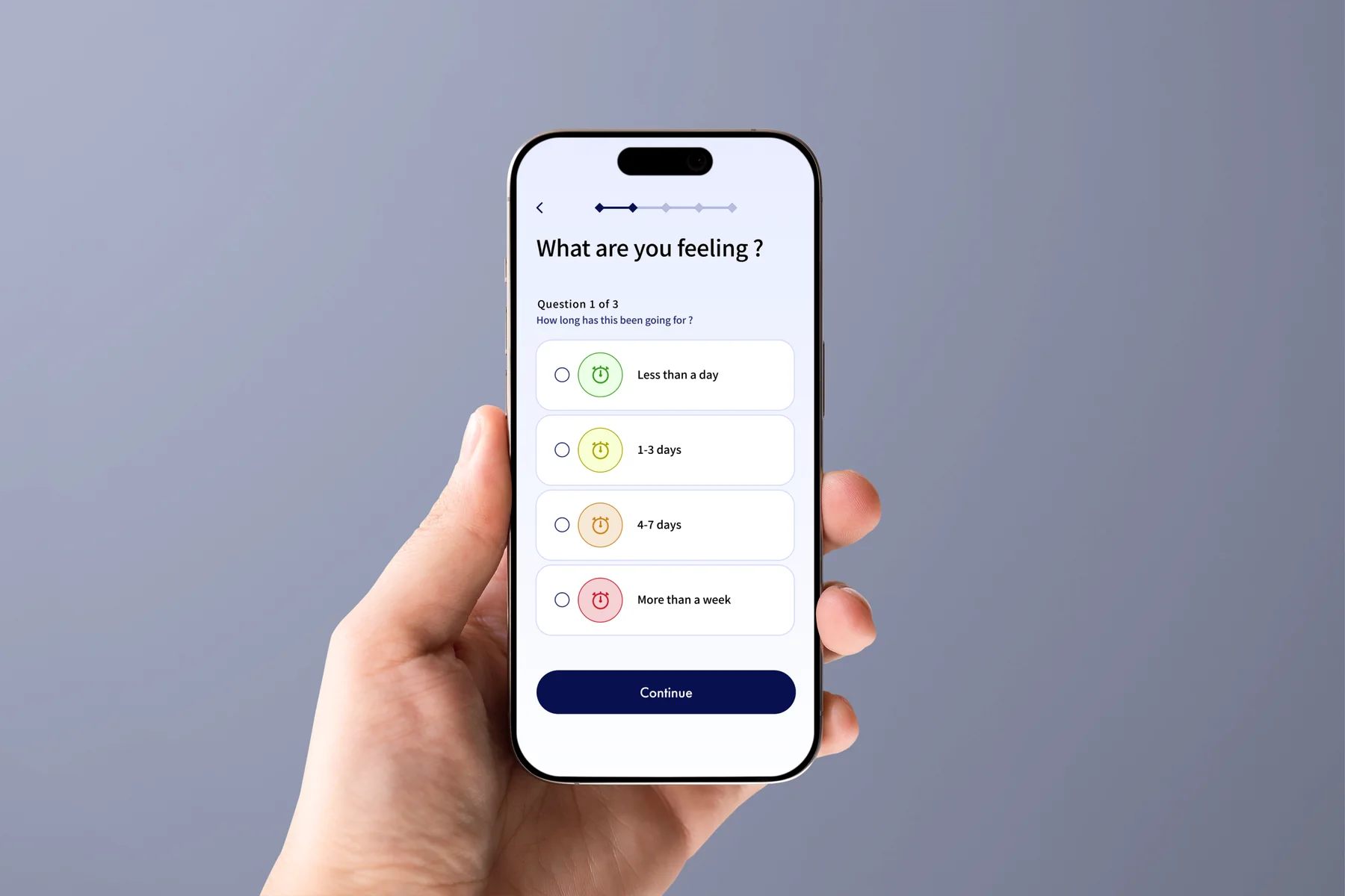
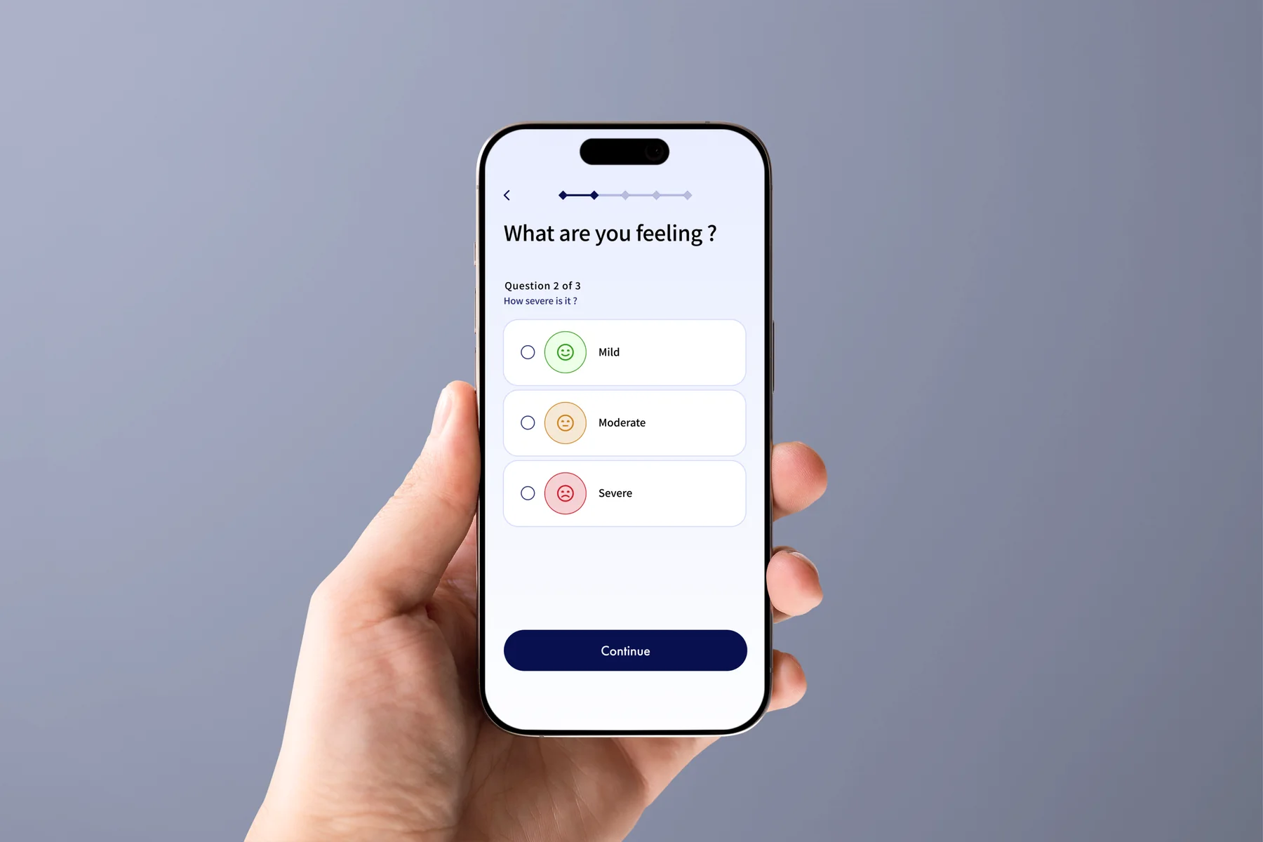
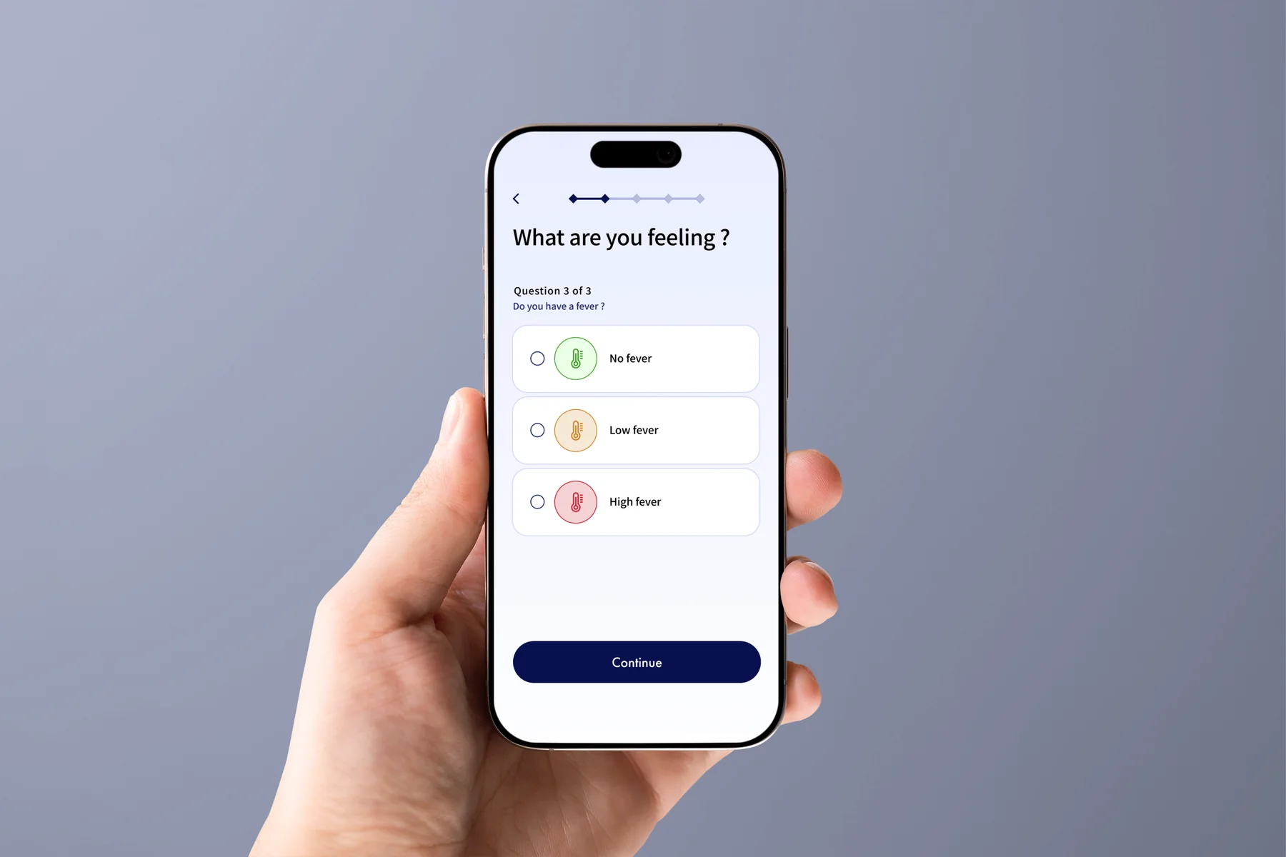
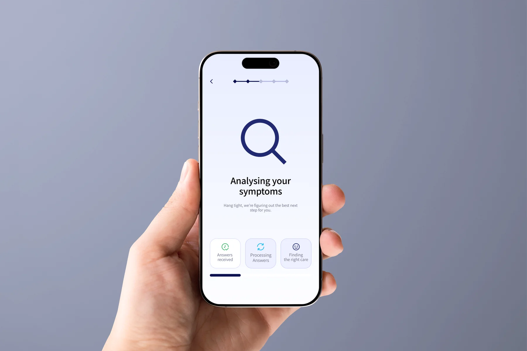
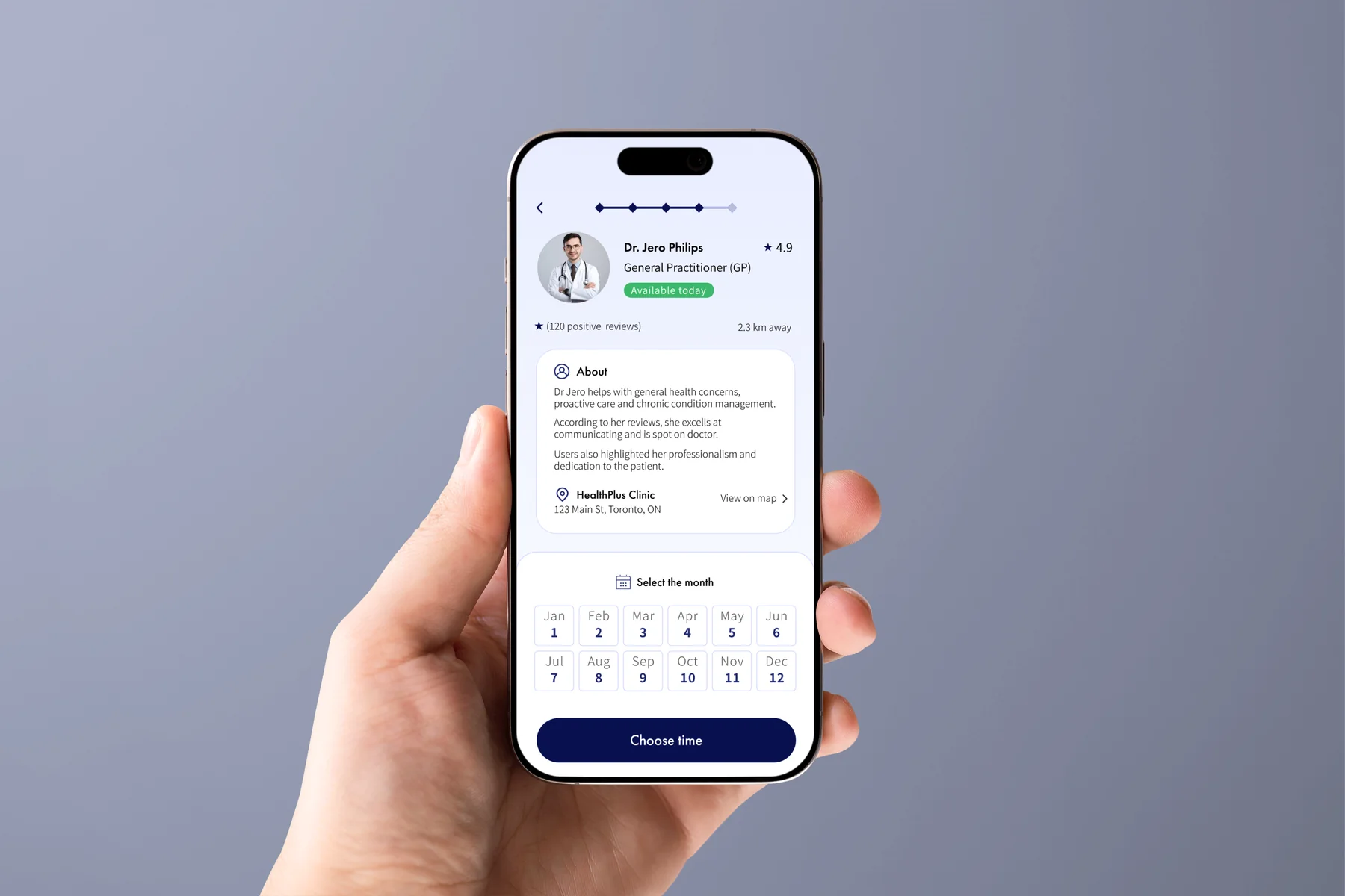
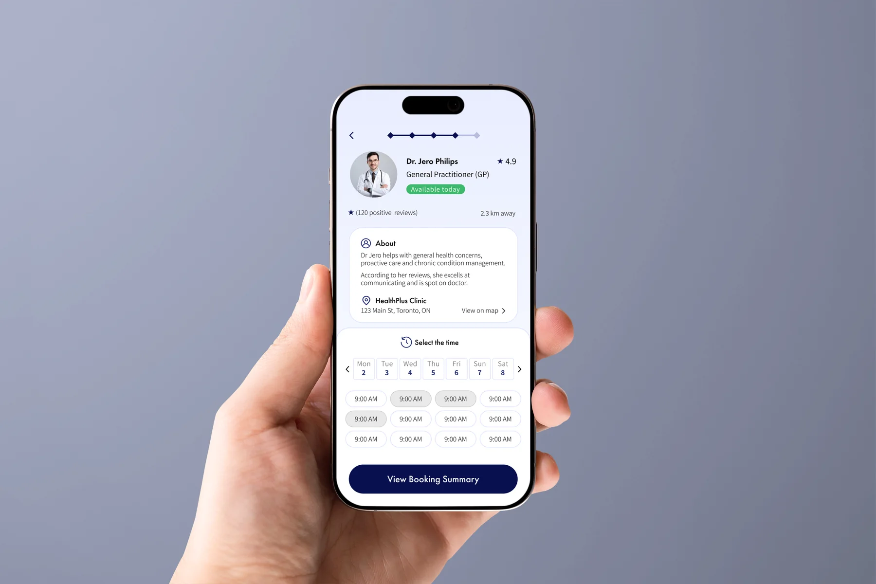
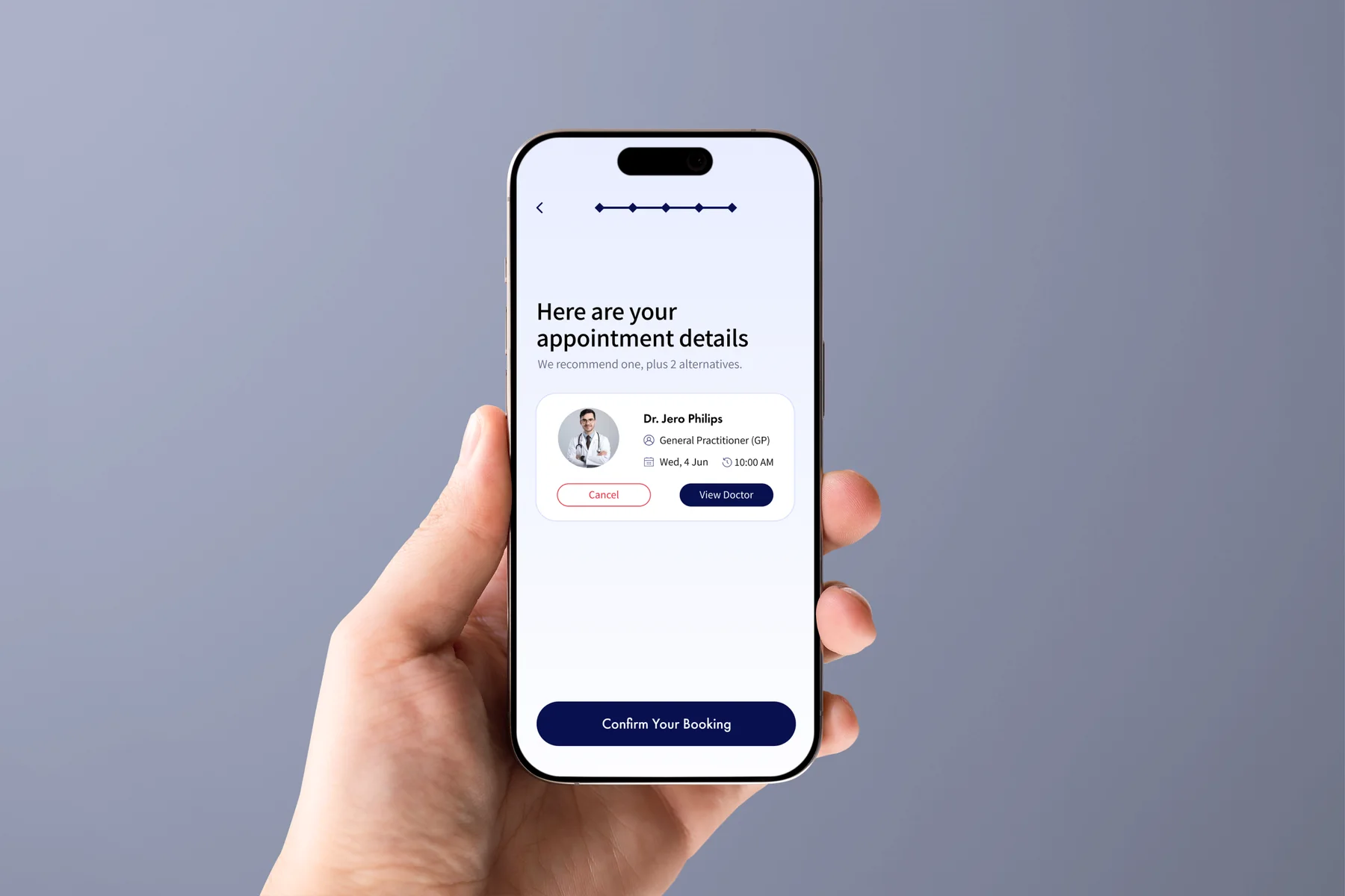
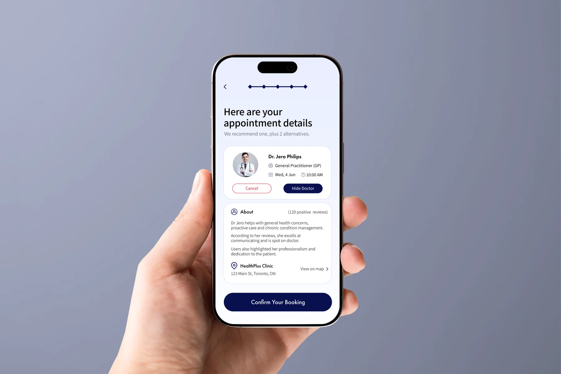
The Problem
People know something feels wrong. They do not always know who to book.
CareRoute focuses on one moment: the user wants care, but the right starting point is unclear.
Long lists of possible conditions
Search results can add more questions when the user is trying to decide what to do next.
Doctor directories appear too early
Users may be asked to compare doctors before they understand which care type fits their situation.
Important details are scattered
Availability, distance, credentials, and appointment details need to stay visible during the decision.
User Interviews
Different users. Same starting problem.
I spoke with three people about how they search for care when they feel unwell but do not know which doctor to book. The interviews focused on where they start, what creates friction, what builds trust, and what makes booking difficult.
Needs a clear starting point
She is unsure which care type fits her symptoms and delays booking when the path feels confusing.
"I don't know if I need a GP, specialist, or urgent care."
Needs availability early
He wants to see real appointment slots quickly and complete the booking outside business hours.
"An online system that shows real slots and lets me book at 9pm would be a massive improvement."
Needs plain language
She wants calm explanations, local doctors, and a recommendation she can understand.
"I just want something simple I can trust."
Repeated Patterns
- 01
Users often know their symptoms but not the relevant care type.
- 02
Too much information can make the search harder.
- 03
Availability, distance, and credentials matter when comparing doctors.
- 04
Users want direction without being told they have a diagnosis.
Secondary Research
Three issues were worth investigating further.
The secondary research supported the interview findings and helped narrow the design priorities.
Choosing a specialty is not always obvious
When the correct starting point is unclear, users may delay the next step or search across several options.
Long condition lists can add confusion
People looking for direction may end up with more questions when results focus on possible conditions.
Booking forms can ask too much too early
A long form before the user understands the value of the product can create avoidable friction.
Sources reviewed in the working file included Springer Nature, Nature, and The Guardian.
Research Synthesis
The research changed the order of the experience.
The strongest patterns translated into four product decisions.
Research InsightDesign Response
Users often know their symptoms but not the relevant care type.Recommend a care type before showing doctors.
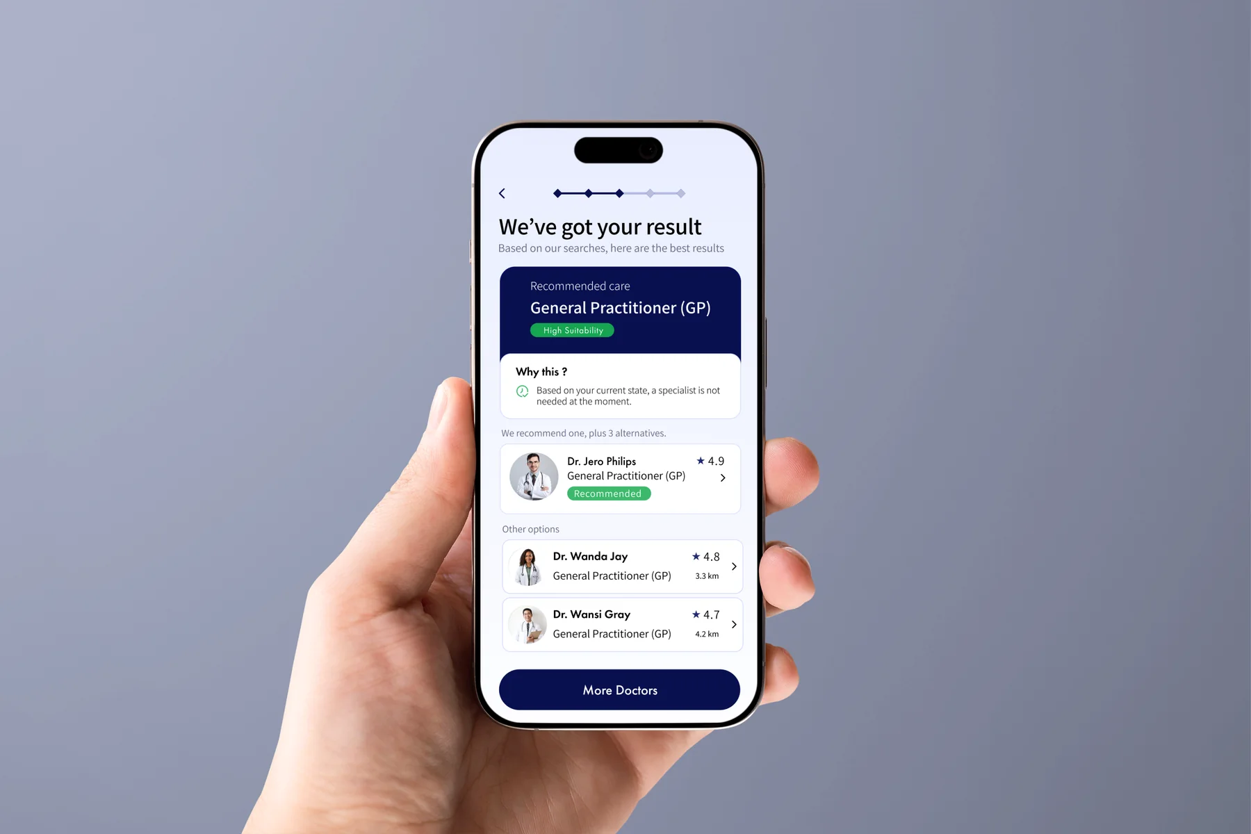
Users want to understand why a recommendation fits.Add a short explanation with the recommendation.
Doctor directories create too many choices too early.Show matching doctors only after routing.
Availability, distance, and credentials matter during comparison.Keep those details visible on doctor cards.
Journey Shift
Direction comes before doctor choice.
The flow changes the order in which users receive information.
Feels UnwellSearches OnlineGets OverwhelmedTries to Choose a DoctorBooks Care
Feels UnwellDescribes SymptomsGets a Care TypeCompares DoctorsBooks an Appointment
Core Insight
Direction before doctor choice.
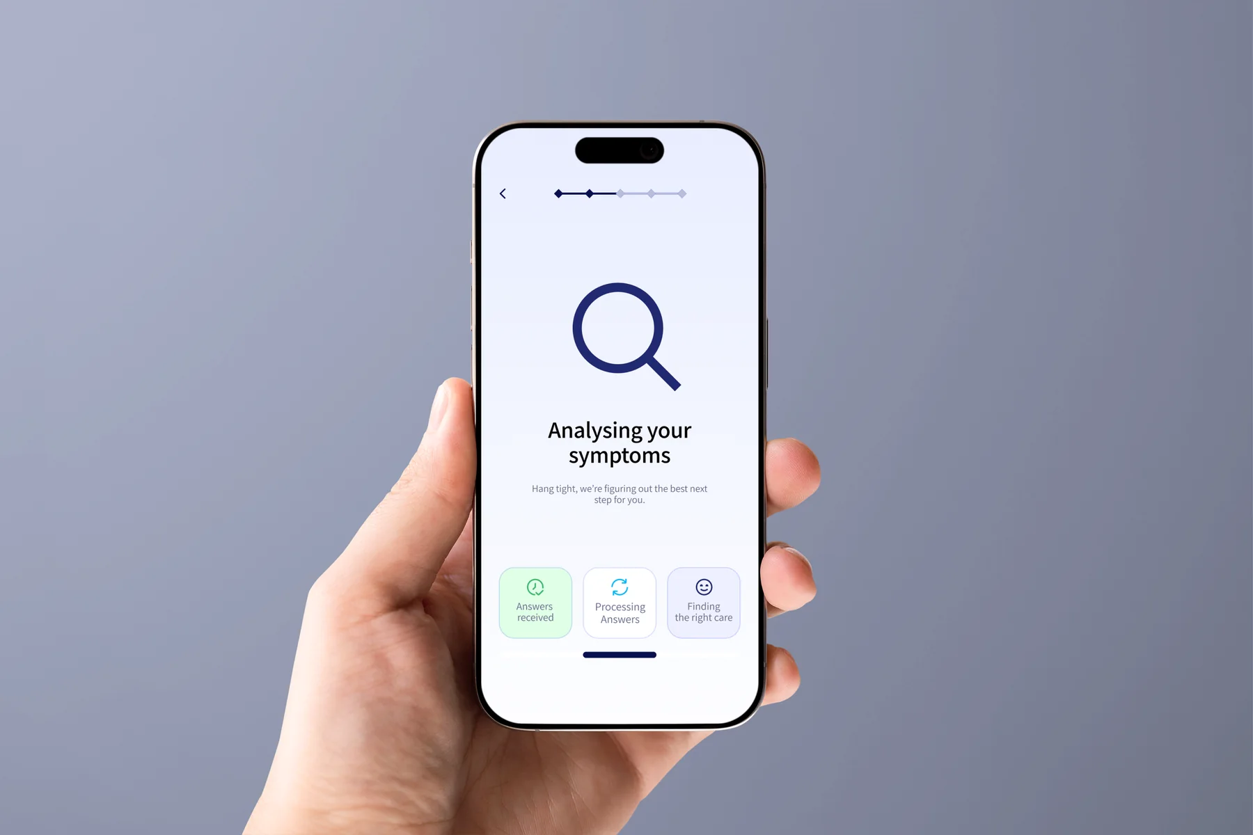
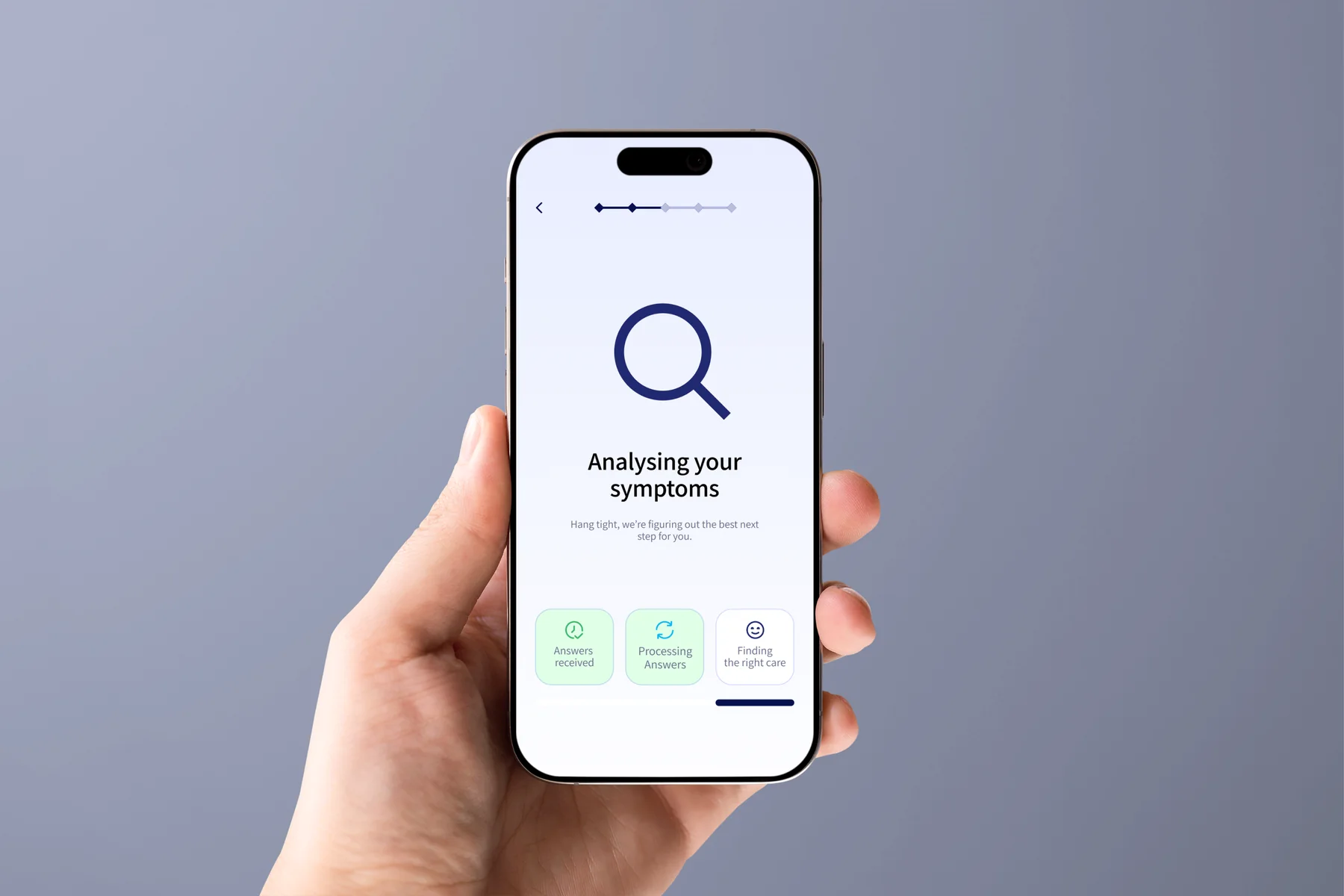
Instead of opening with a doctor directory, CareRoute first asks about symptoms and context. It then recommends a care type before showing matching doctors.
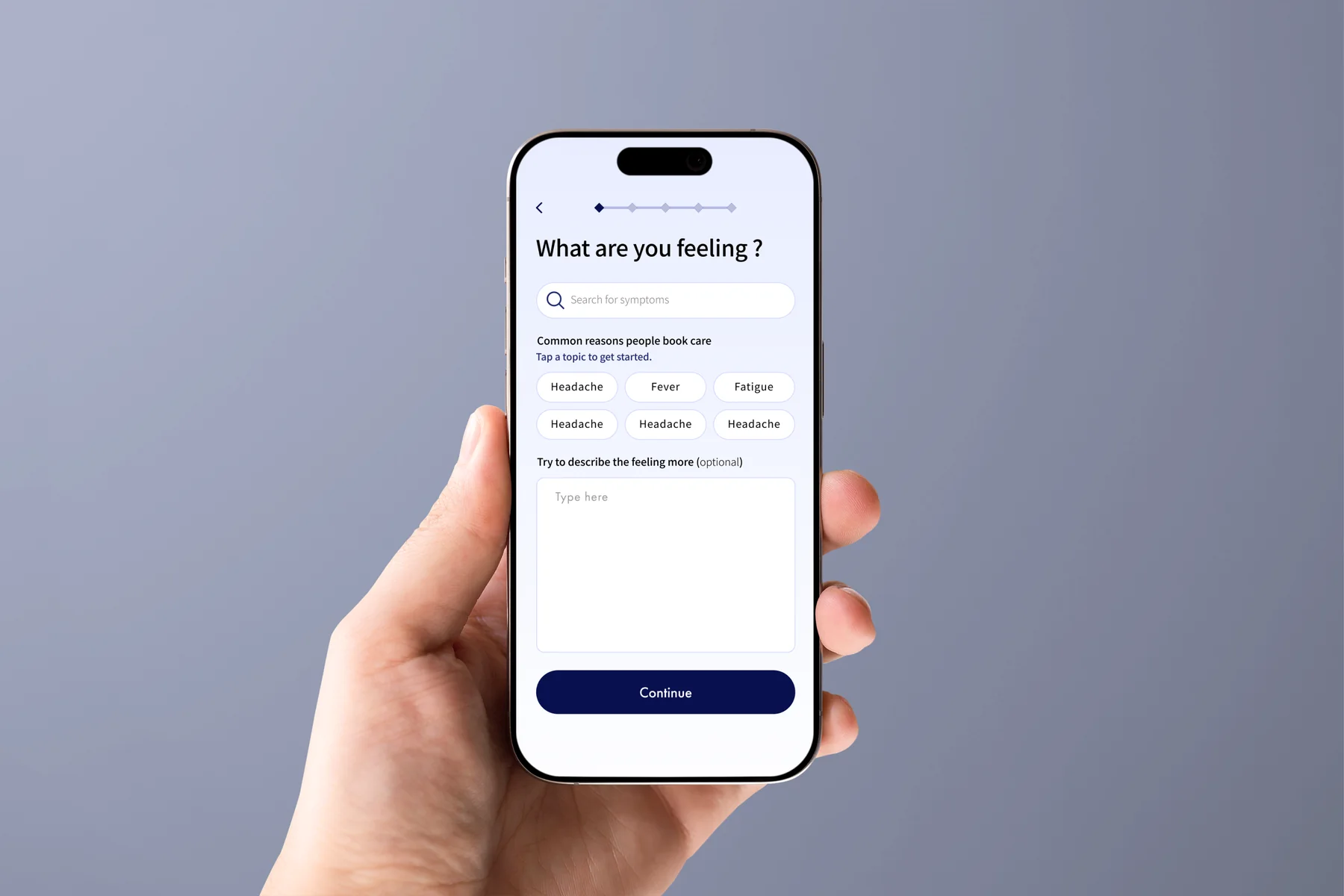
Free text first. Structure second. Users describe the issue before the interface narrows the path.
Direction beats diagnosis. The app focuses on the next suitable type of care, not a list of possible conditions.
Comparison before commitment. Doctors appear after the recommendation, with the details needed to compare options.
Product Requirements
What CareRoute needs to do.
- 01
Help users understand the right care type before showing doctors.
- 02
Avoid presenting the experience as a diagnosis.
- 03
Ask symptom questions one step at a time.
- 04
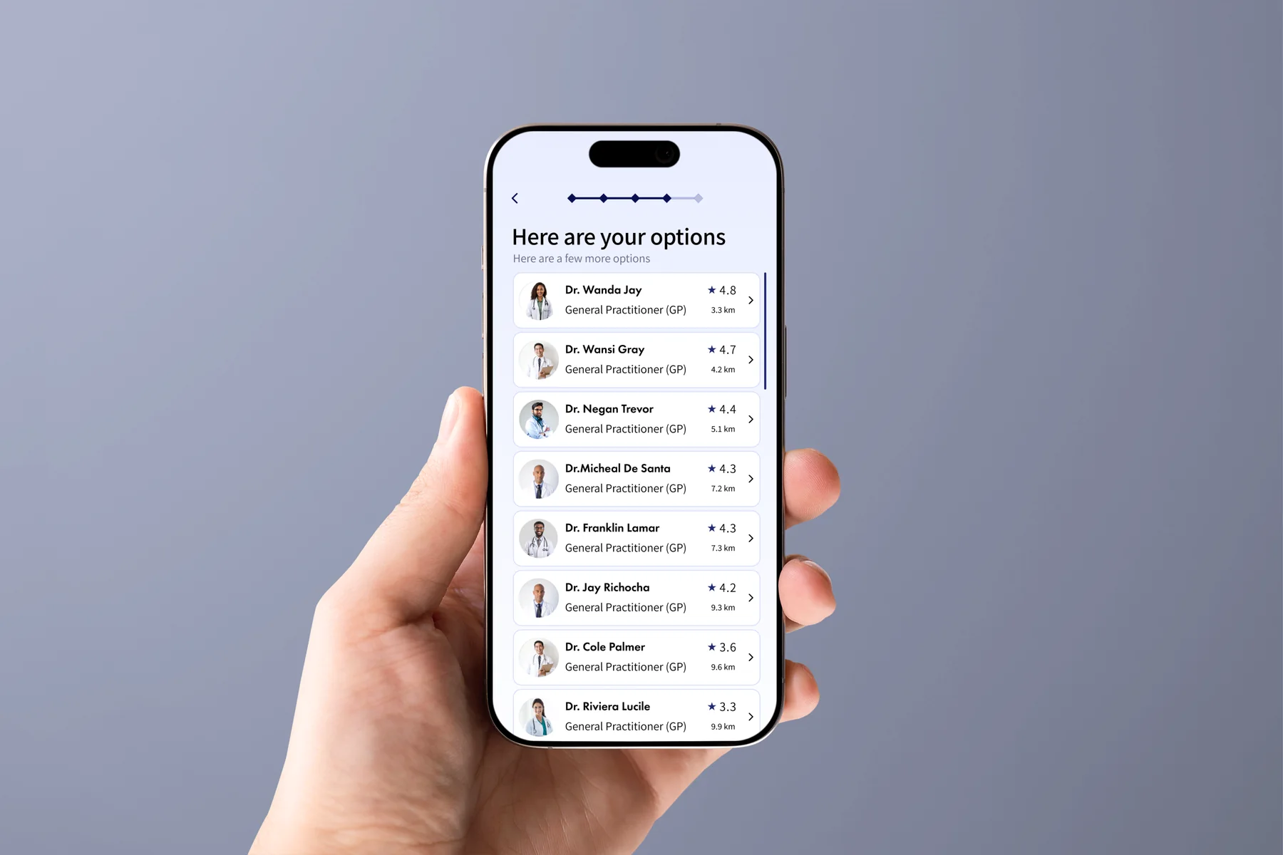
Show doctors based on specialty, rating, distance, and availability.
Main User Flow
Symptoms to care type to booking.
The main flow keeps the decision order simple.
Describe SymptomsAnswer Focused QuestionsReceive a Recommended Care TypeCompare Suitable DoctorsChoose a Time SlotBook an Appointment
Key Design Decisions
The interface asks for only what the user needs at each step.
Free-text symptom entry
Users can explain what feels wrong in their own words before selecting structured options.
Focused follow-up questions
Each step asks for only the information needed at that moment, avoiding an overwhelming medical form.
Care type before doctor selection
The result screen explains the recommended care type before individual doctors appear.
Practical doctor comparison
The doctor list shows credentials, distance, and availability upfront.
Final Screens
The complete booking flow.
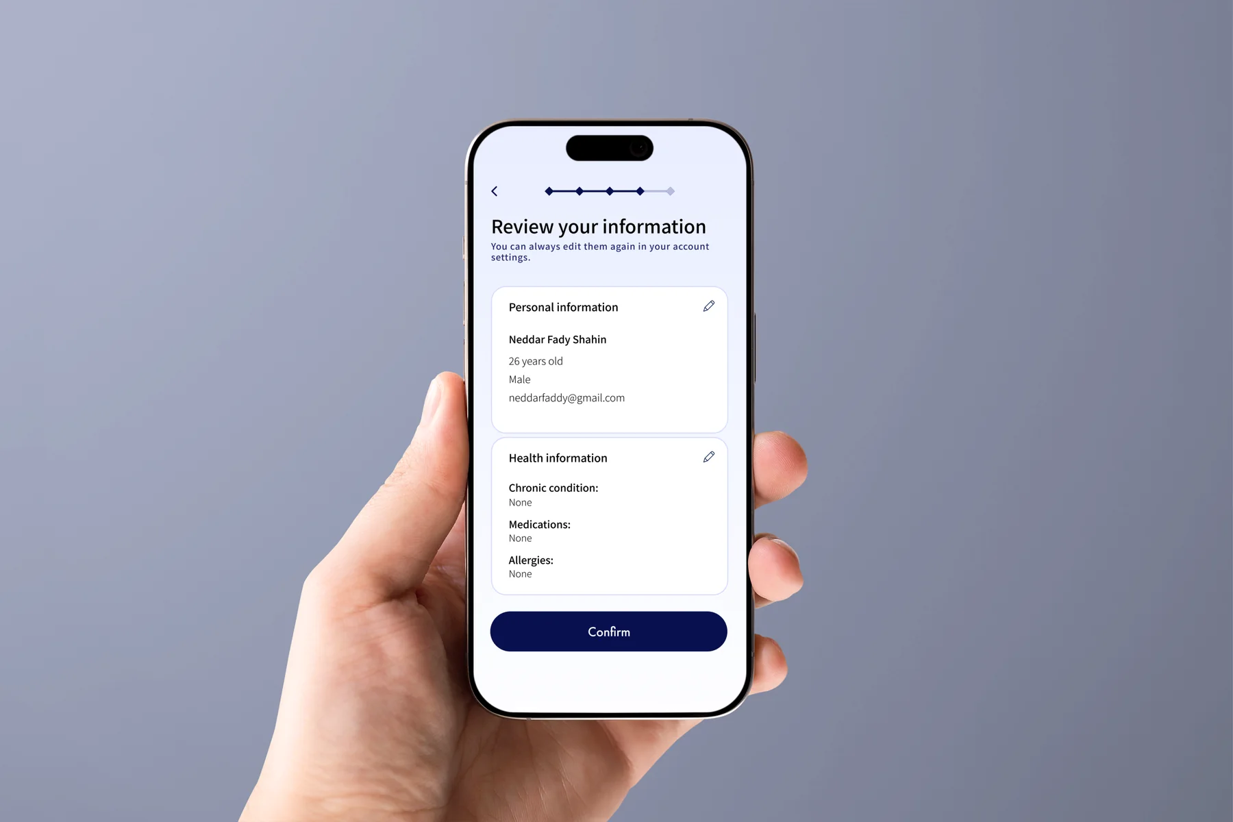
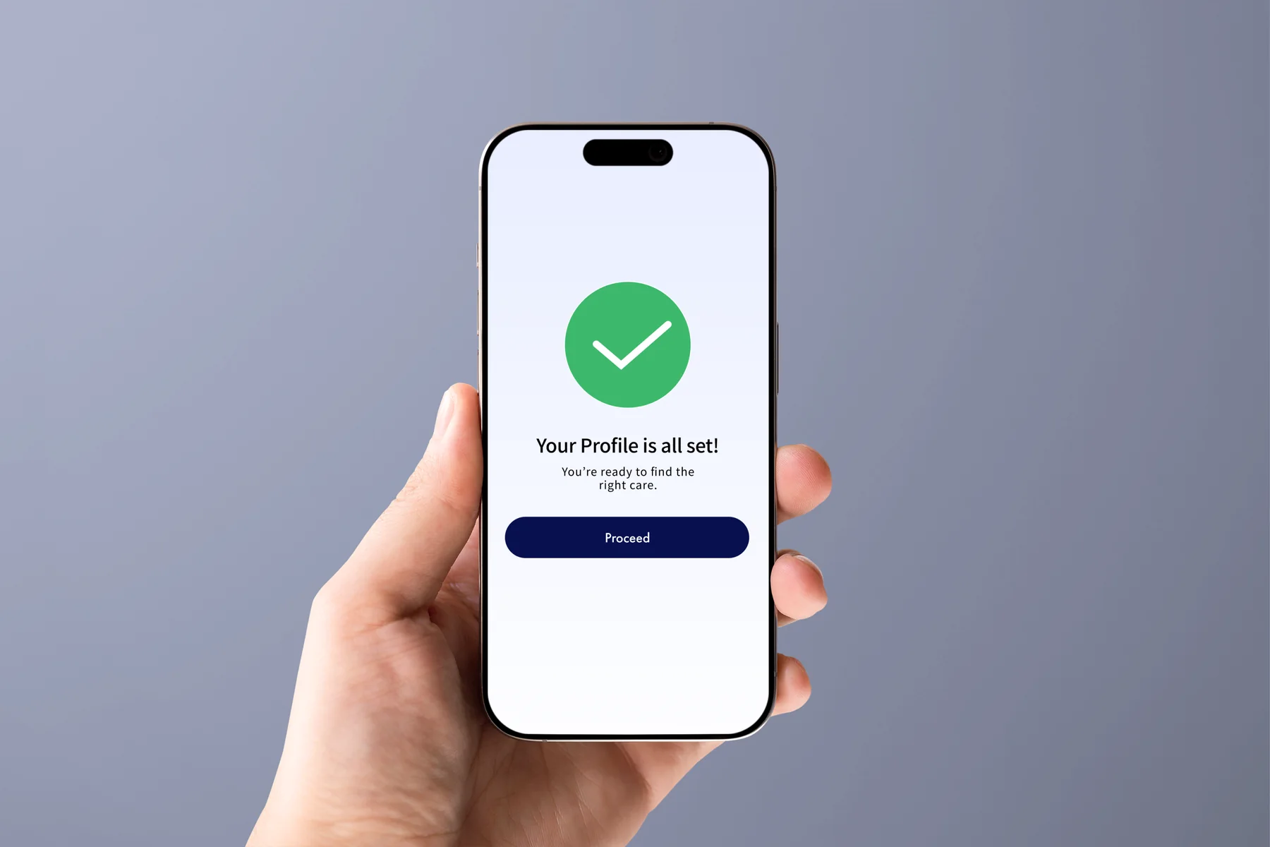
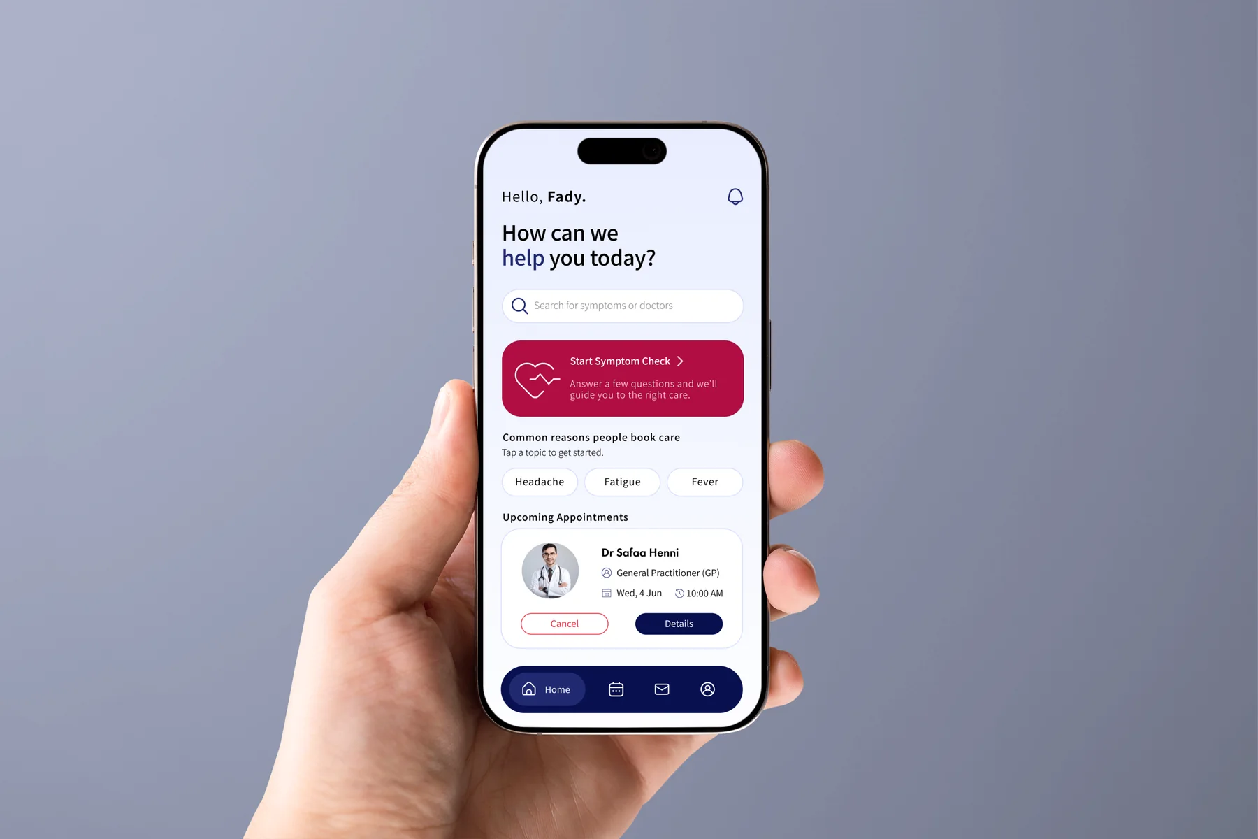
The main screens show symptom entry, structured questions, the care-type recommendation, doctor comparison, time selection, a booking summary, and confirmation.
Main flow preview
Drag or scroll through the core flow.
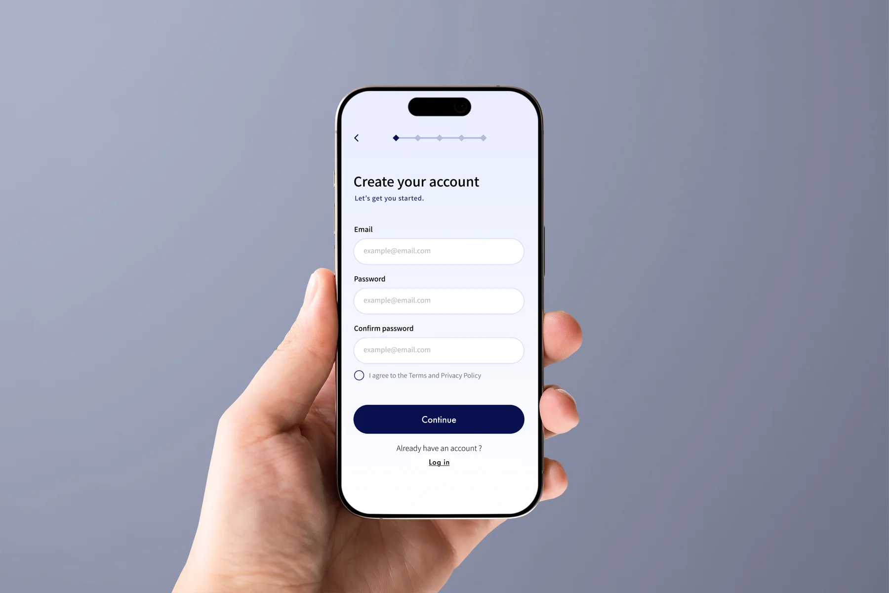
Drag / scrollSign Up
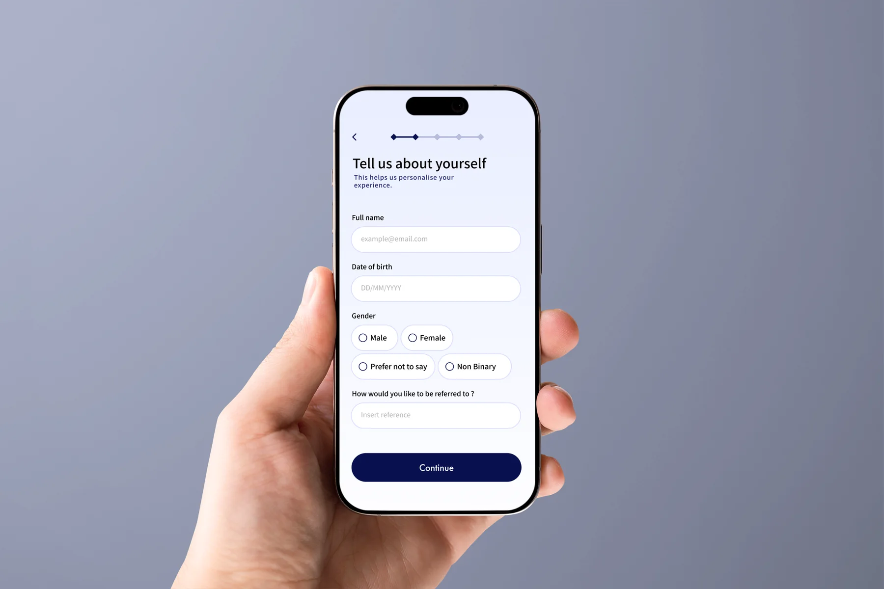
Account setup happens before the appointment is saved.
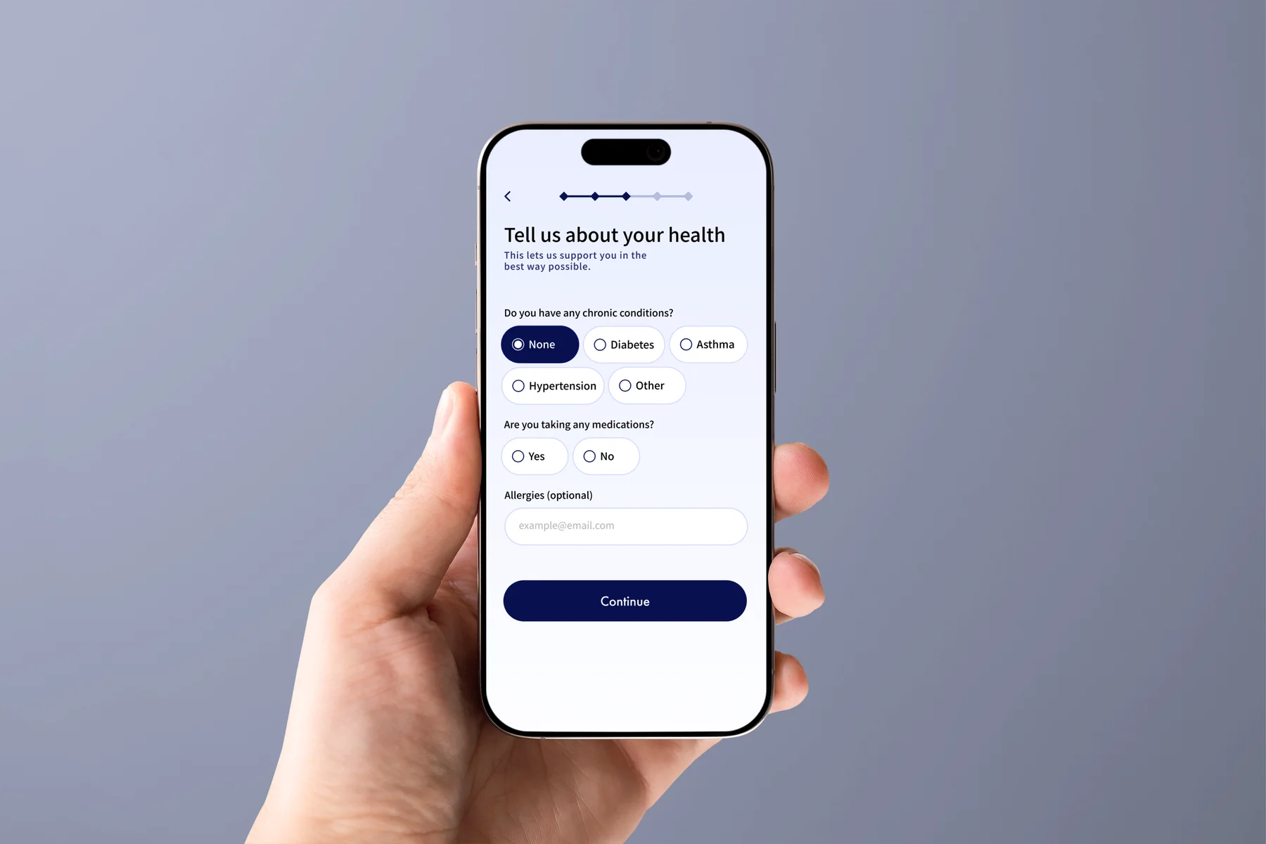
The prototype asks users to create an account and enter the personal details needed for booking. I would test whether this should happen earlier or only once the user is ready to confirm.
Booking Summary
The final review keeps the appointment details in one place.
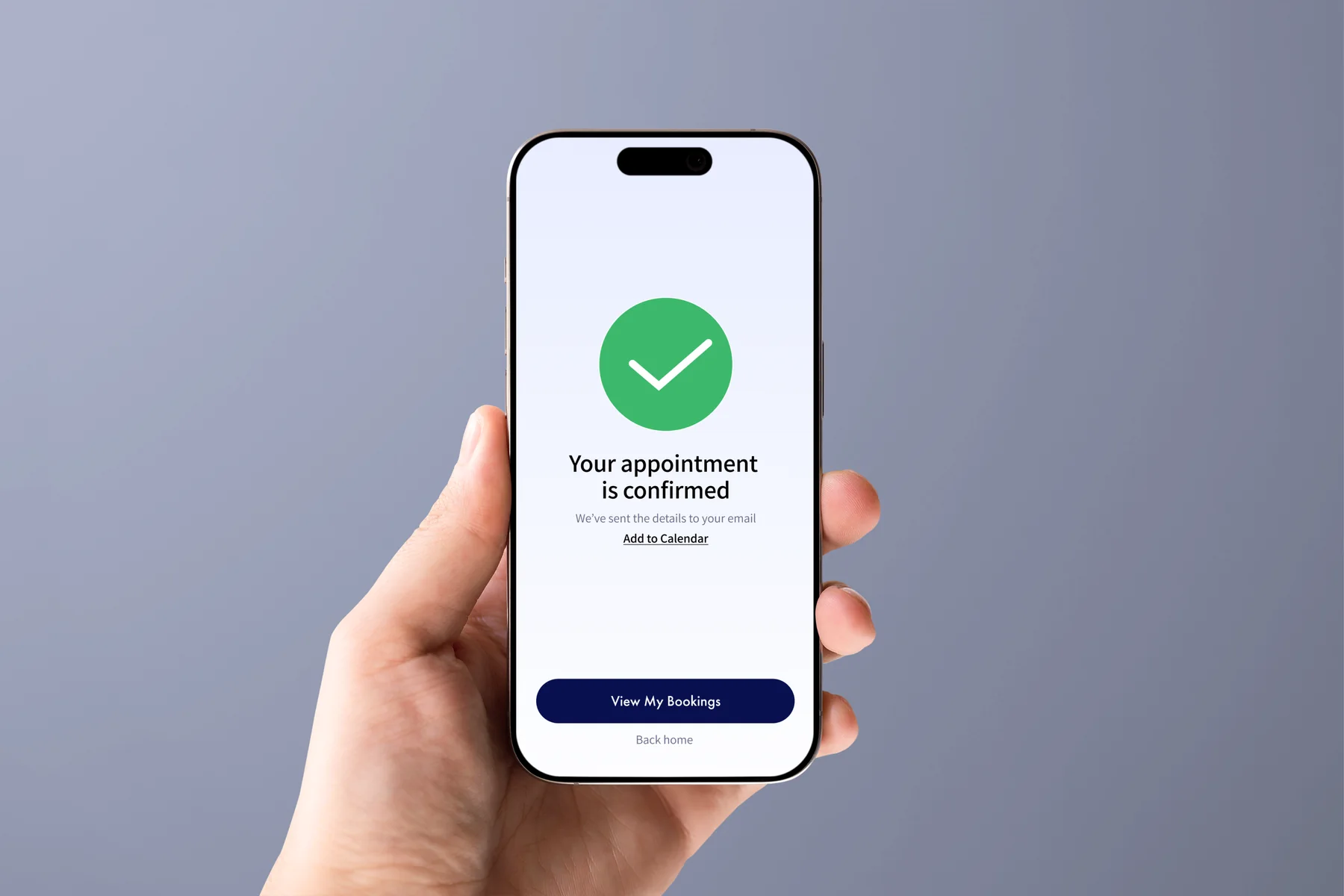
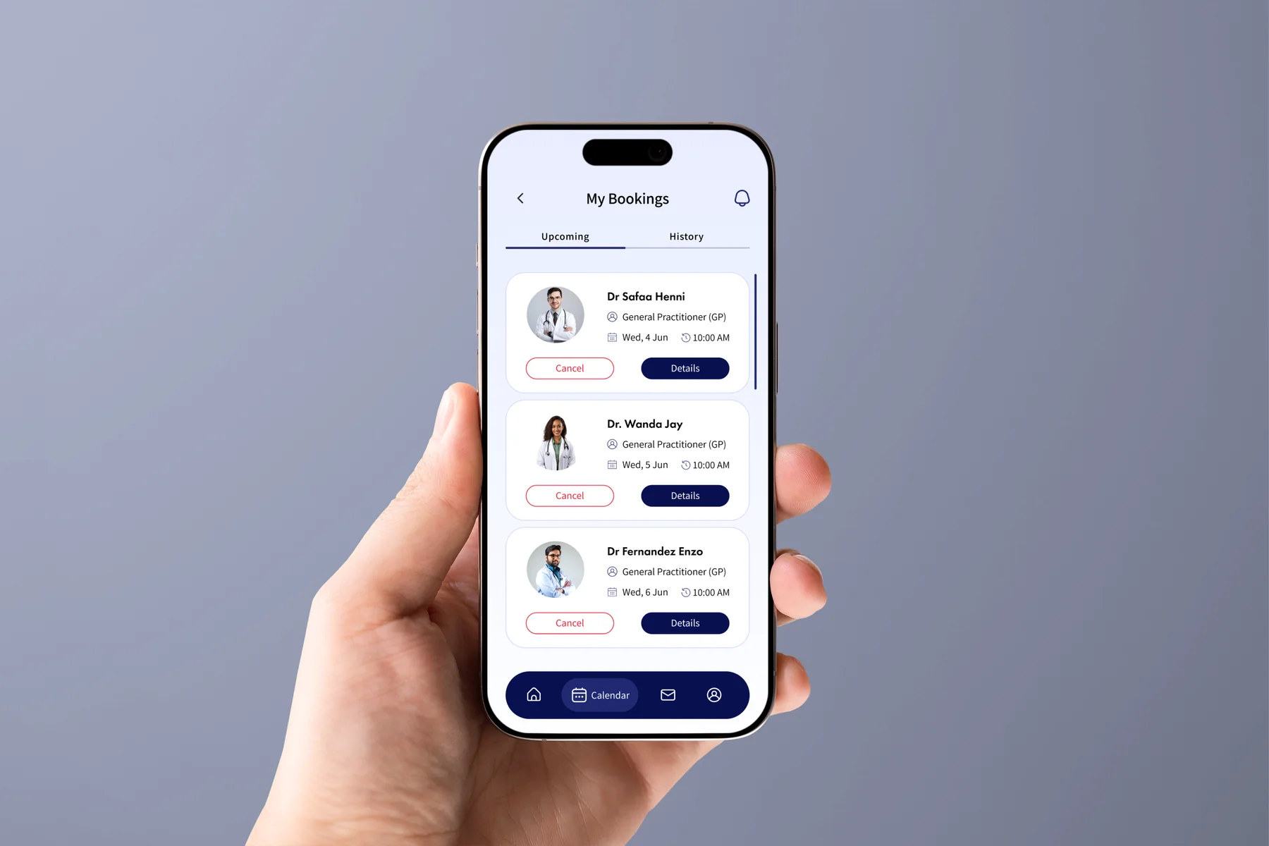
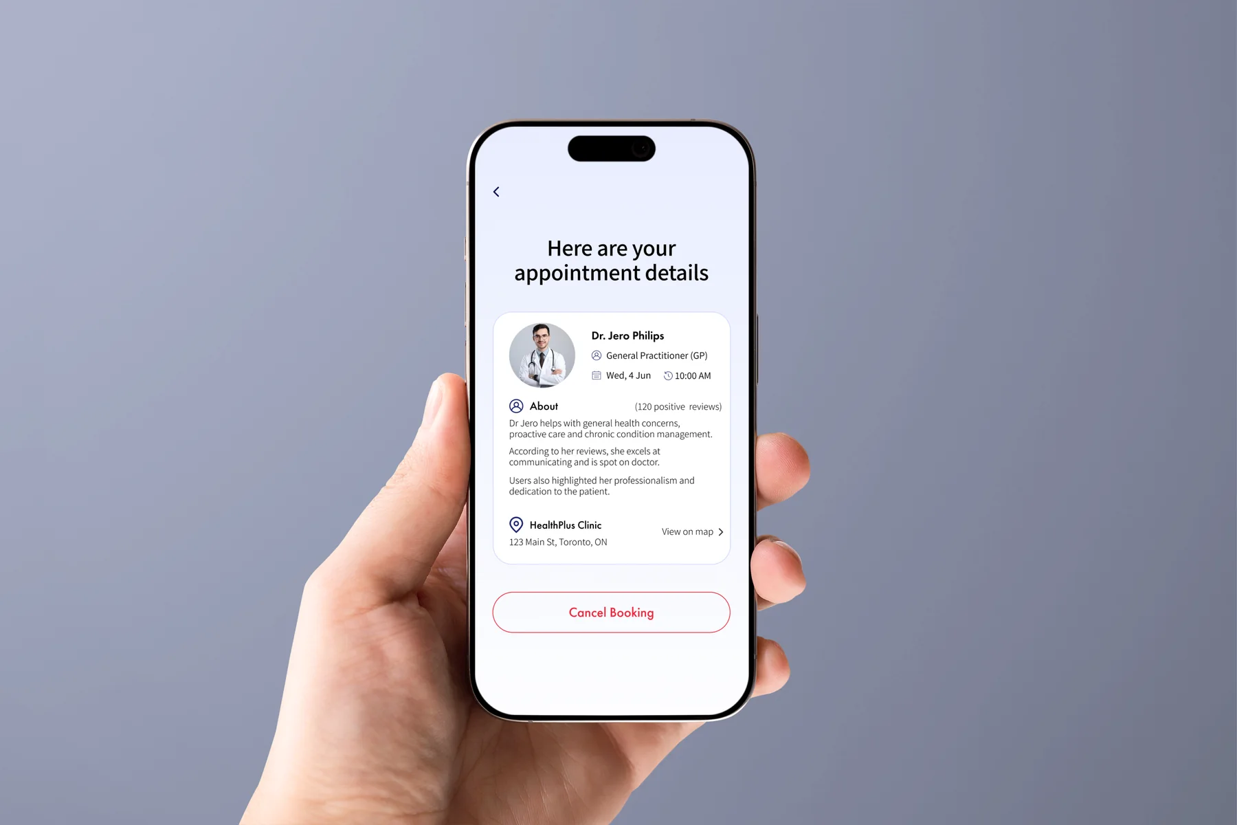
Before confirming, the user can review the doctor, care type, date, time, location, and preparation details. The confirmed appointment remains available from the bookings area.
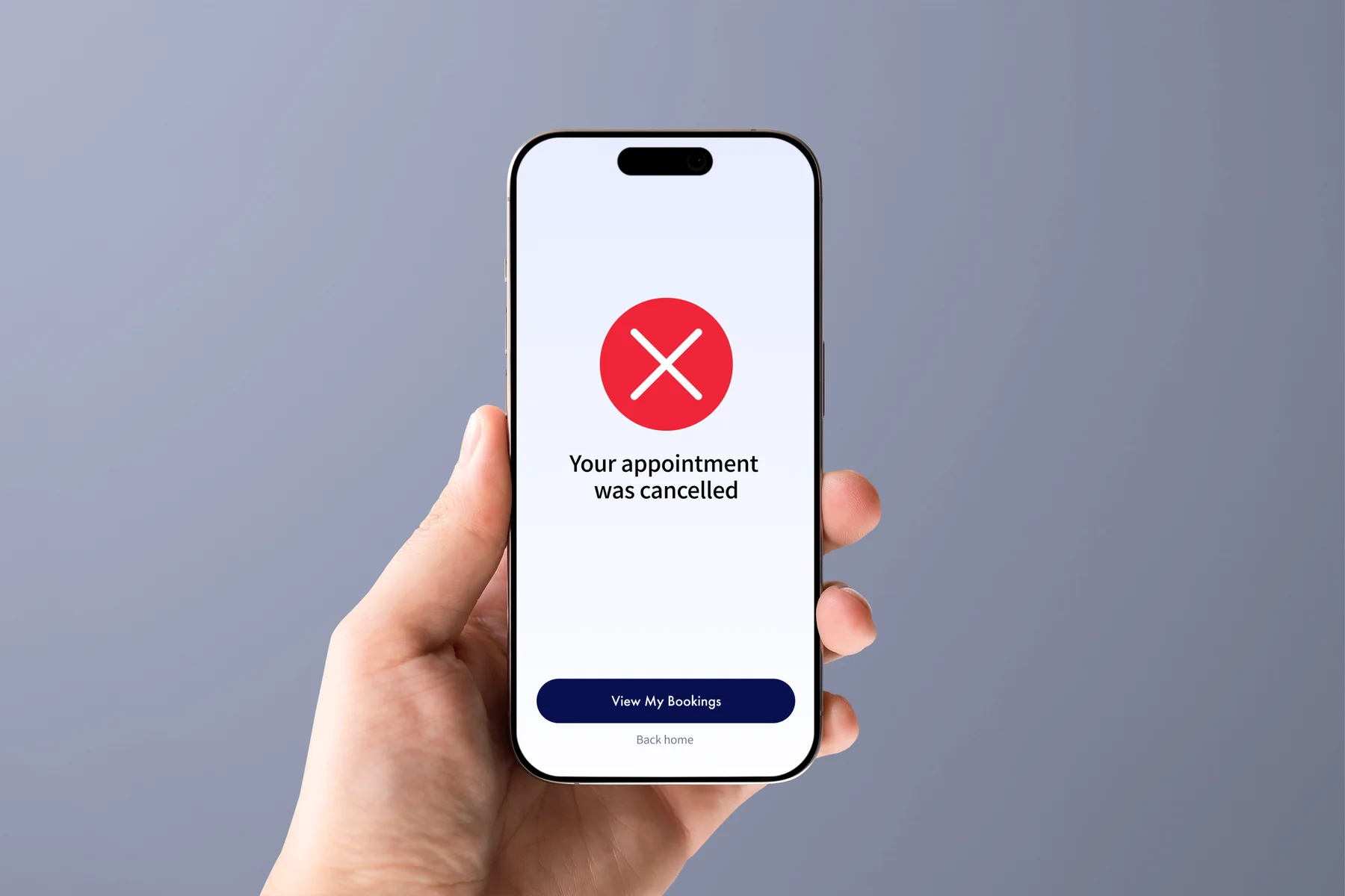
Booking Cancellation
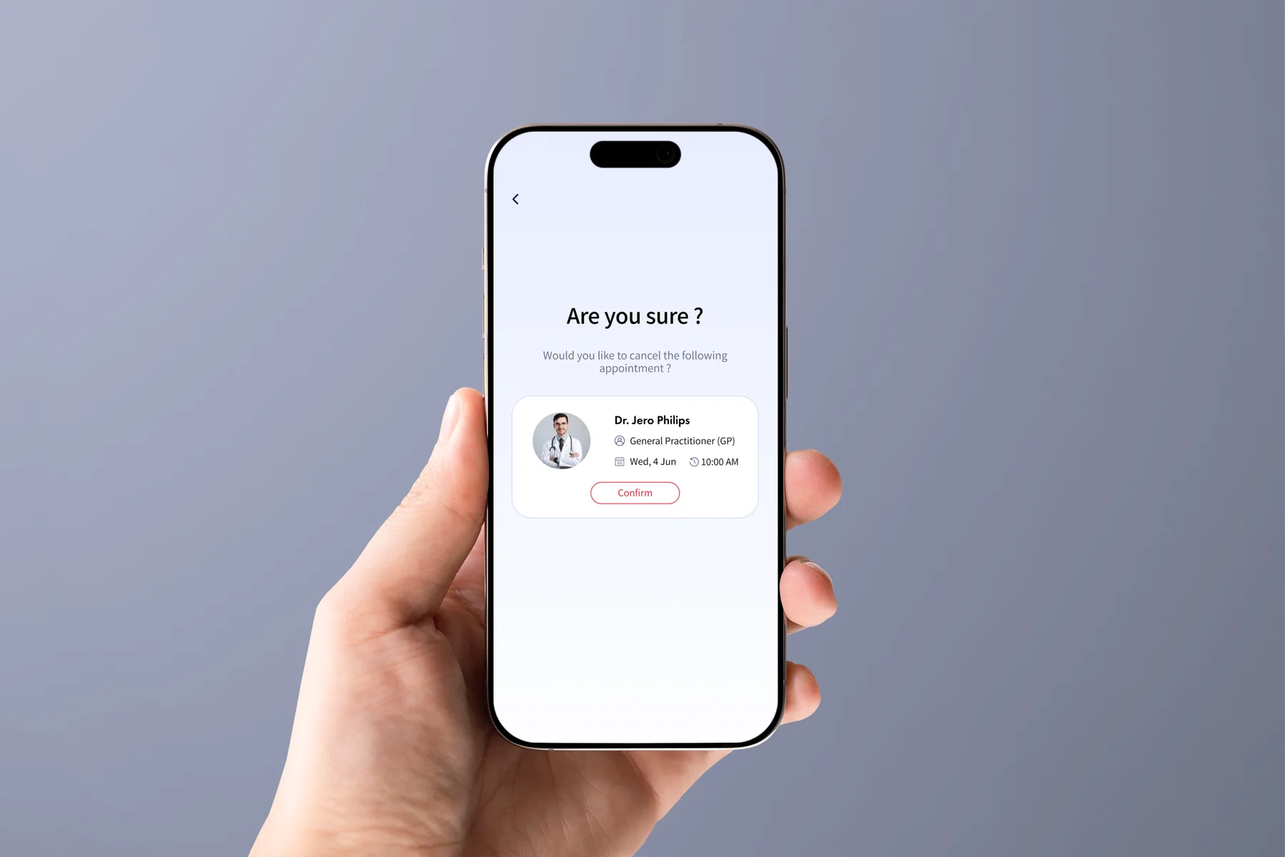
Cancellation uses a clear confirmation step.
The user reviews the cancellation before committing, sees a success state, and can return to the bookings area afterward.
Prototype to Final UI
The visual system became clearer without changing the core flow.
These early prototypes helped test structure and screen order. The final UI keeps the same product logic while improving hierarchy, spacing, and comparison clarity.
Prototype evolution
Swipe through five before-and-after pairs.
Drag / scrollPrototype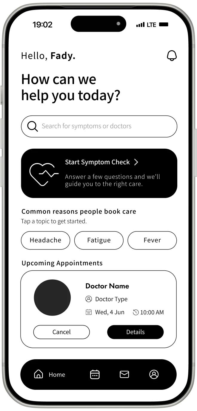
Final UI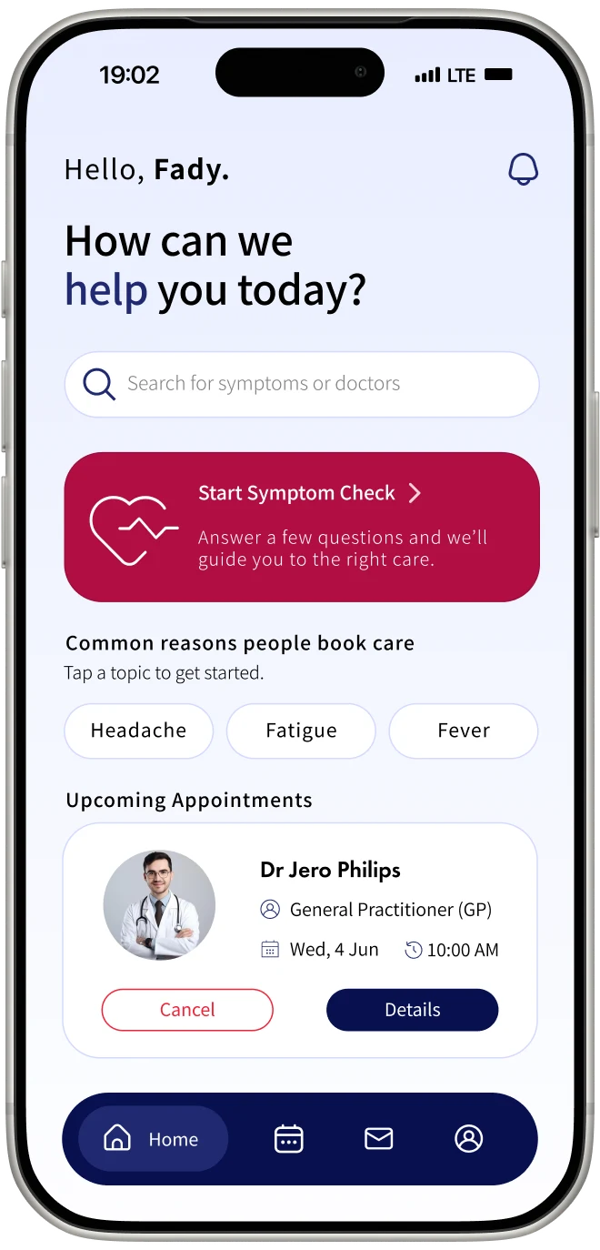
Home feed
Prototype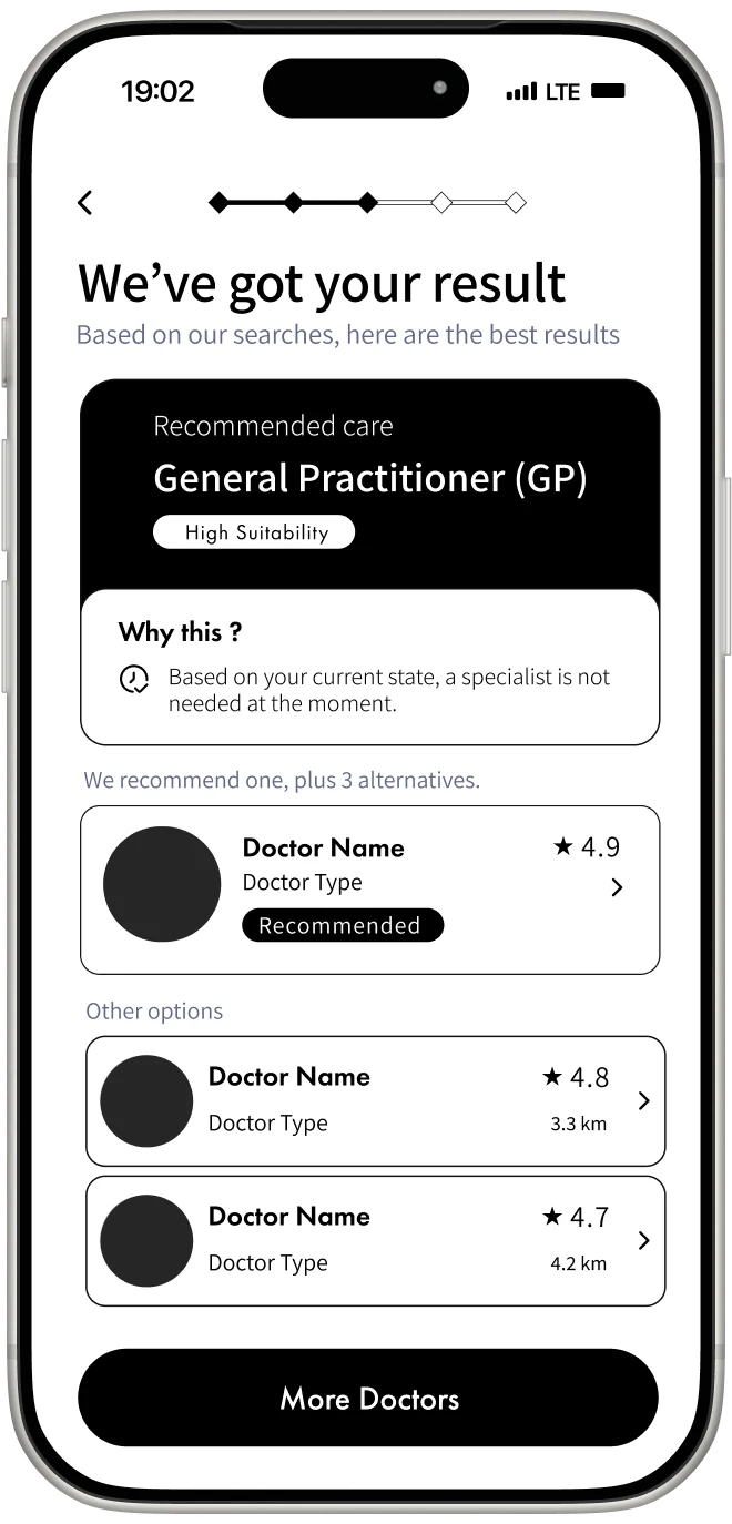
Final UI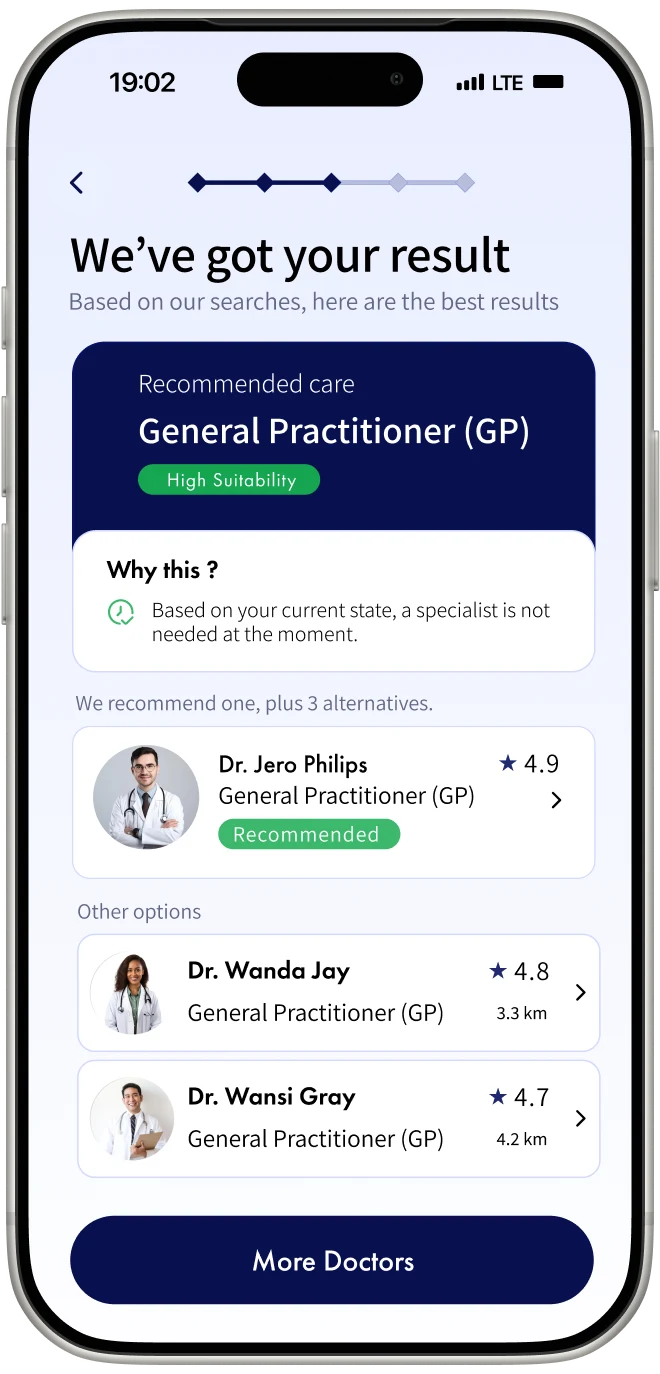
Care-type recommendation
Prototype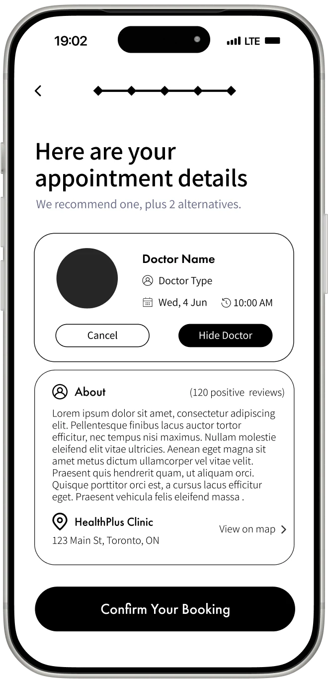
Final UI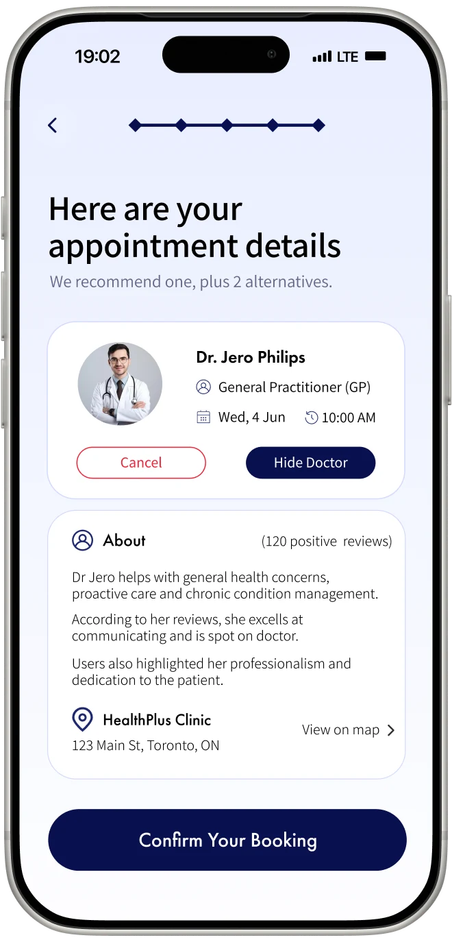
Appointment details
Prototype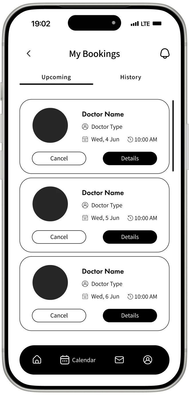
Final UI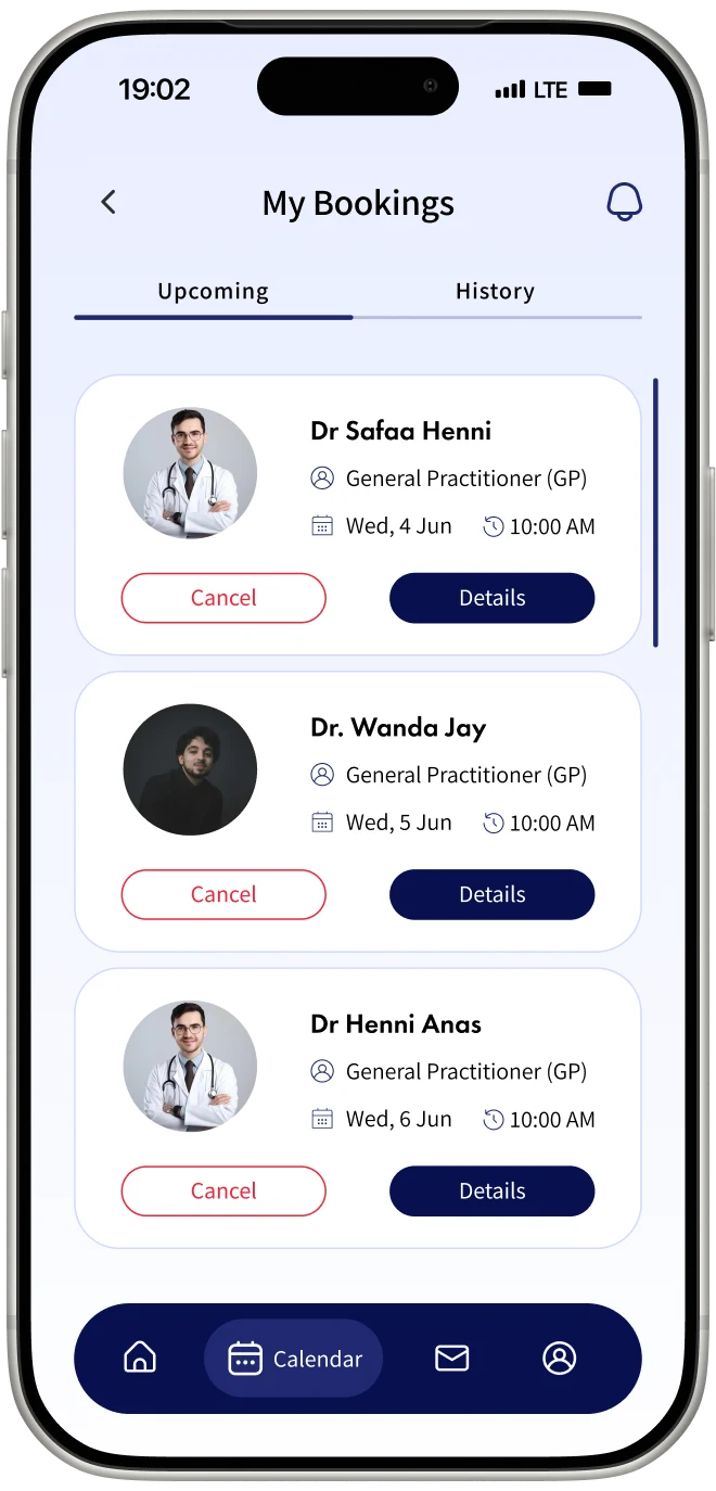
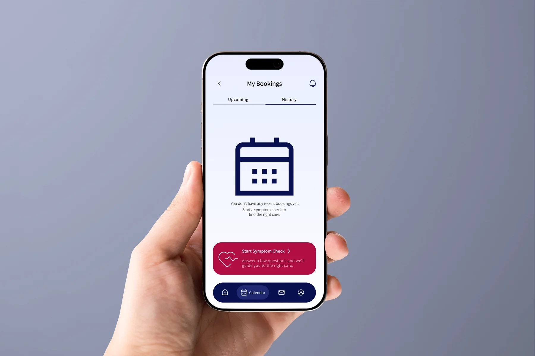
Upcoming bookings
Prototype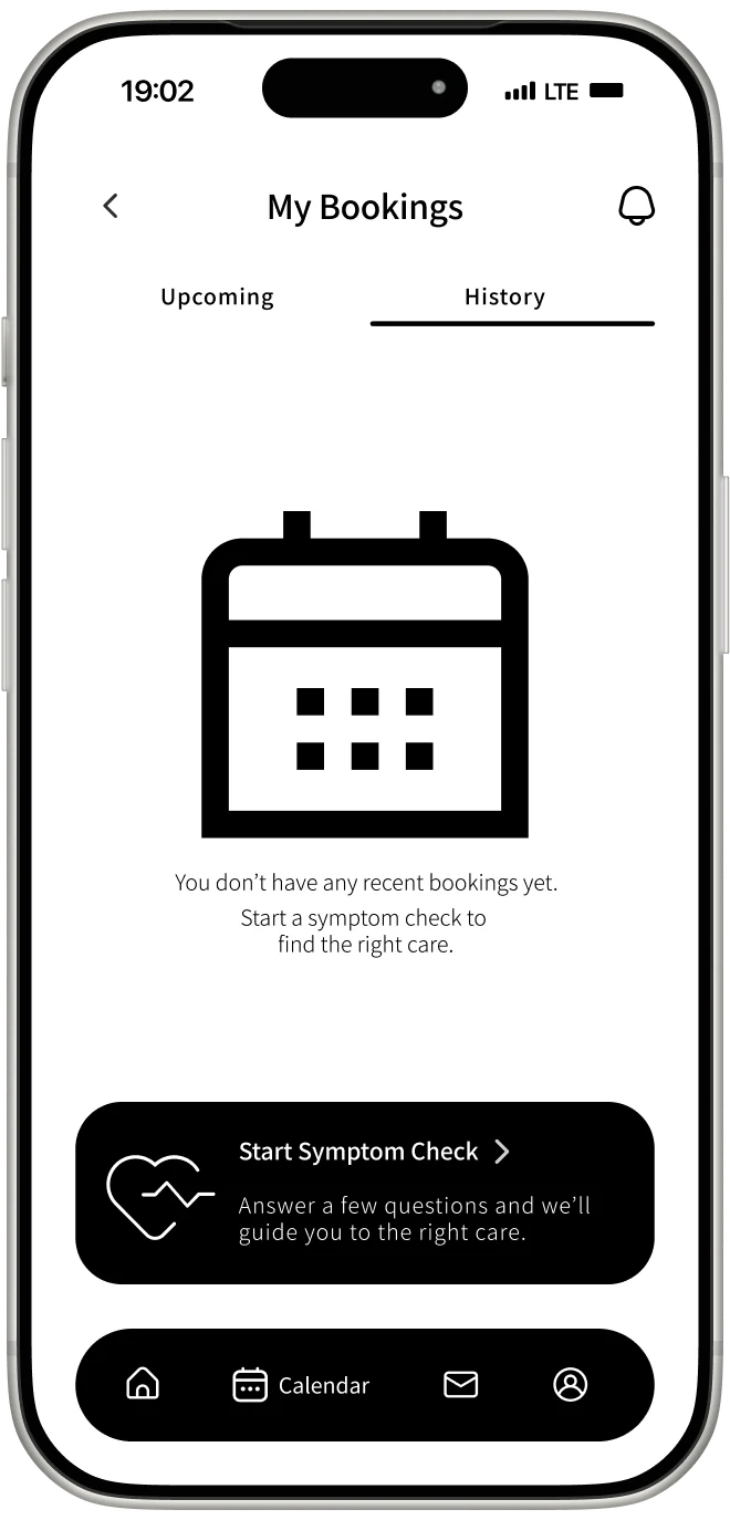
Final UI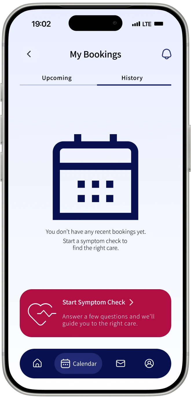
Booking history
Before and After
The concept changes the order of the decision.
BeforeCareRoute Approach
Search results can overwhelm users with possible conditions.The flow focuses on the next suitable type of care.
Doctor directories appear before users know what they need.Care type comes before doctor comparison.
Users must remember details while moving between screens.Key comparison details stay visible.
Booking confirmations can feel incomplete.Appointment details and preparation steps appear together.
Tradeoffs and Limitations
The prototype shows the experience, not a clinically validated product.
The routing logic is simplified. A real implementation would require clinical validation and input from healthcare professionals.
I would test whether users prefer completing a profile upfront or starting the symptom flow first and adding details when booking.
A real product would need validated routing rules, healthcare input, and careful recommendation language.
A real healthcare product would also need clinically validated escalation rules for urgent symptoms. That is not included in this prototype.
Next Steps
What I would test next.
Do users understand the care-type recommendation without reading it as a diagnosis?
Does profile setup feel too demanding before users receive value?
Do users trust the explanation behind the recommendation and have enough information to compare doctors?